
. In Power BI Desktop, there are several views and formats available to help users work with data, create models, and design reports. Here’s an overview of the primary views and formats available:
### Available Views:
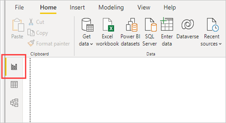
1. Report View:
– Purpose: Used for designing and creating visualizations and reports.
– Features:
– Drag and drop fields to create charts, graphs, maps, and other visuals.
– Add and format report elements like titles, text boxes, images, and shapes.
– Use slicers and filters to enable interactive data exploration.
– Arrange visuals on multiple pages to build comprehensive reports.
2.Data View:
– Purpose: Used for viewing and exploring the underlying data.
-Features:
– Displays the data in a table format, similar to a spreadsheet.
– Allows inspection of individual columns and rows.
– Supports simple data cleaning and transformation operations directly on the data.
3. Model View:
– Purpose: Used for managing and creating relationships between data tables.
– Features:
– Visual representation of tables and relationships in the data model.
– Ability to create, edit, and delete relationships between tables.
– Define hierarchies, create calculated columns, and manage table properties.
### Available Formats:
1. Visualizations:
– Charts and Graphs: Bar charts, line charts, pie charts, area charts, scatter plots, and more.
– Maps: Filled maps, bubble maps, and shape maps.
– Tables and Matrices: Table visuals and matrix visuals for displaying detailed data.
– Cards: Single number visuals to highlight key metrics.
– KPIs: Key performance indicators to track progress against a goal.
– Gauges: Gauge charts for visualizing data against a target range.
– Custom Visuals: Additional visuals from the Power BI marketplace.
2. Data Formatting:
– Conditional Formatting: Apply color scales, data bars, and icon sets to tables and matrices.
– Number Formatting: Customize the display of numbers, currencies, dates, and times.
– Text Formatting: Adjust font styles, sizes, colors, and alignments for text elements.
– Visual Formatting: Customize visual elements like titles, backgrounds, borders, and tooltips.
3. Themes and Templates:
– Themes: Apply pre-defined or custom themes to standardize the look and feel of reports.
– Templates: Save and reuse report layouts and styles for consistency across multiple reports.
### Additional Features:
1. Slicers:
– Interactive filters that allow users to segment and filter data visually on the report.
2. Bookmarks:
– Save specific views of a report page, including filters and slicer states, for easy navigation and storytelling.
3. Drill-through and Drill-down:
– Enable users to navigate from summarized data to detailed data within the same report.
4. Tooltips:
– Provide additional context or data when hovering over a visual element.
5. Custom Report Elements:
– Add images, shapes, and buttons to enhance report design and interactivity.
These views and formatting options in Power BI Desktop provide robust tools for creating insightful, interactive, and visually appealing data reports and dashboards.
7.A dashboard in Power BI is a single-page, often referred to as a canvas, that uses visualizations to tell a story. Because it is limited to one page, a well-designed dashboard contains only the most important elements of that story. Here are the key aspects and features of a Power BI dashboard:
### Key Aspects and Features:
1. Single Page (Canvas):
– Dashboards are single-page views, making them succinct and focused on the most critical metrics and insights.
– They provide a high-level overview rather than detailed analysis.
2. Tiles:
– The building blocks of a dashboard are tiles. Each tile represents a visualization, such as a chart, graph, gauge, card, or map.
– Tiles can also include images, web content, and interactive elements like buttons and slicers.
– Users can pin visualizations from different reports to a single dashboard, creating a consolidated view.
3. Interactive Elements:
– Dashboards support interactive elements, allowing users to interact with the data. For example, clicking on a tile can navigate to the underlying report or open a related dashboard.
– Tiles can be refreshed automatically, keeping the data up-to-date.
4. Real-Time Data:
– Dashboards can display real-time data from various sources, making them ideal for monitoring key performance indicators (KPIs) and operational metrics.
– Real-time streaming data tiles can be added for live data feeds.
5. Cross-Source Integration:
– A dashboard can integrate visualizations from multiple reports and data sources, providing a comprehensive view of different aspects of the business.
6. Sharing and Collaboration:
– Dashboards can be shared with other users or groups within the organization, facilitating collaboration.
– Users can comment on dashboards to provide feedback or insights.
7. Custom Alerts:
– Users can set data alerts on specific tiles to receive notifications when data reaches a certain threshold, ensuring they are promptly informed of critical changes.
8. Mobile Access:
– Power BI dashboards are accessible via mobile apps, ensuring users can stay informed and interact with their data on the go.
Other courses: